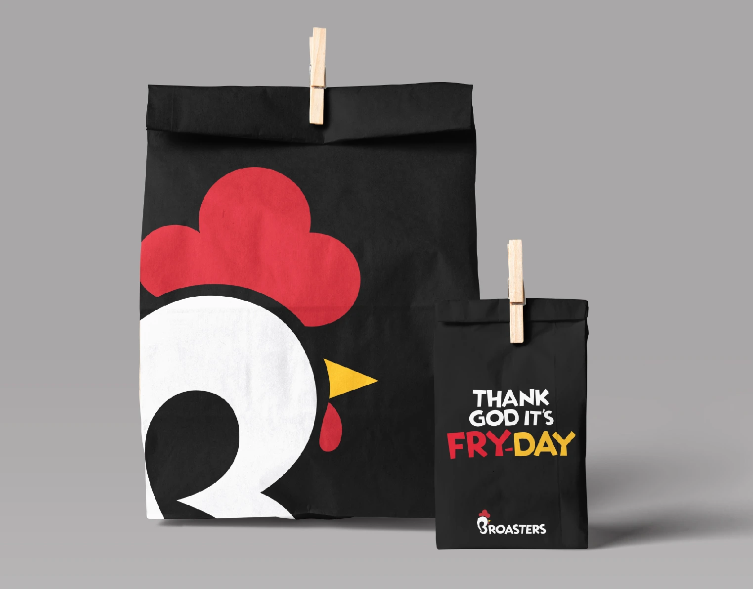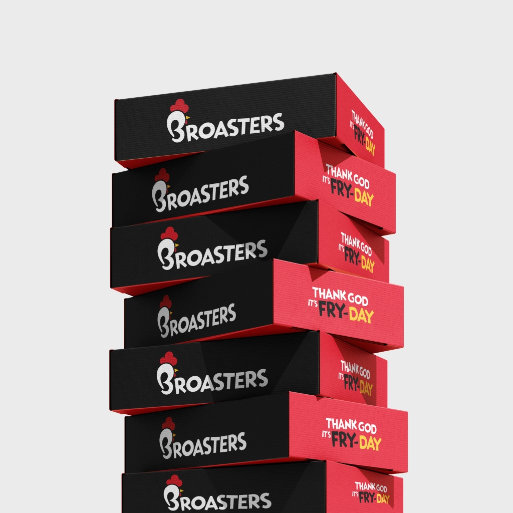
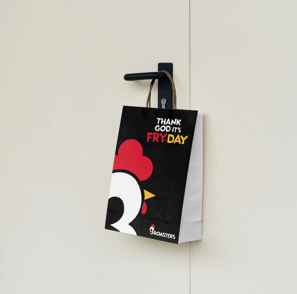
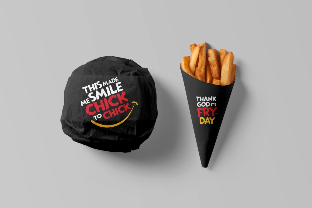

We were tasked with revitalising Broasters’ Identity to better engage a young, dynamic audience. The reimagined logo incorporated a chicken inspired desig, paired with witty taglines to establish a playful and relatable brand voice. This fresh identity brought a vibrant, approachable vibe to the fast-food chain.
The scope of work included designing menus, packaging, stickers, staff caps, and other branded materials, ensuring a cohesive and memorable customer experience across all touchpoint.